
RSS Feeds: Standard | Remastered |
||
|
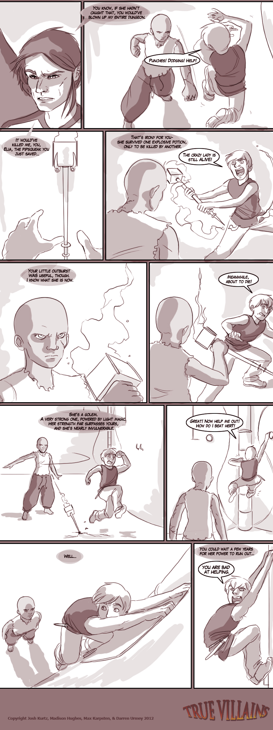
Writers' Blog Maddie: When Max sent me this file, it was called 'Sebastian's been playing too much Assassins Creed'. What a cutie.
Josh: |
Artists' Blog Max: That wall design was an addition to try and make the dungeon look more spectacular - I hadn't planned to have Sebastian climb on it. Same with the torches, they were kind of just a "This panel needs to look cooler" earlier. It was fun to be able to bring them into the foreground. Some smart artist guy once said "If it doesn't propel the story or expand the world, get rid of it." Or something like that. It wasn't me who said it.
Darren: |
|